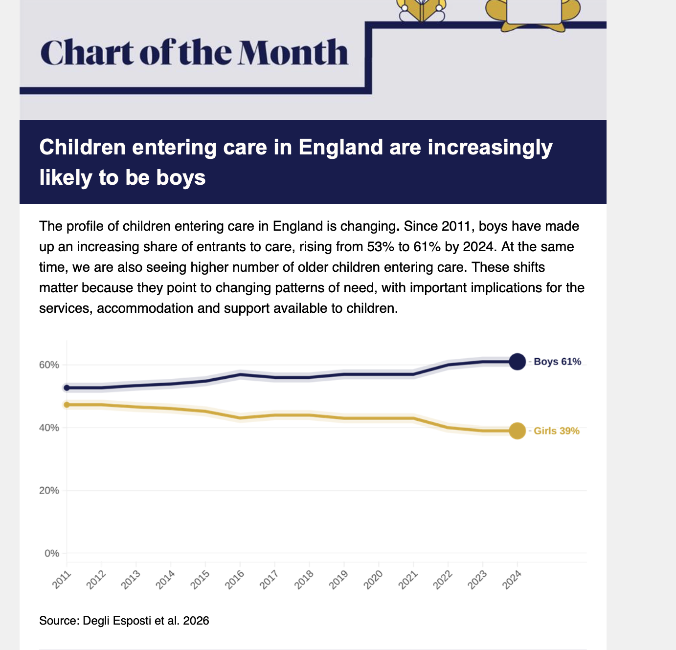
The Nuffield Family Observatory email a ‘Chart of The Month’, which I think is a nice, slow, passive way to consume data visualisations. This month’s chart shows that kids entering the care system are increasingly likely to be boys. It also point out that overall numbers are growing, kids are entering care older, and the system is not really optimised for any of those things.