- Baxter Dury - Pleasure. Walking south towards Bedlam?
- Original members of the BBC Radiophonic Workshop at Glastonbury. I was at this and it wasn’t being pro-filmed, so I assume this is from a bunch of fans with GoPros.
- The Human League - 4JG, from The Golden Hour of the Future.
- Cristobal Tapia de Veer - Utopia Finale
I wrote these up just before I left MOO I think.
== General principals ==
=== Optimise for the common case ===
Adding something to satisfy the needs of a small number of users confuses the rest. The tools we build should satisfy the needs of the majority of users.
=== Build tools that on meeting one simple need ===
Tools should focus on solving one problem e.g. “Signing up for a newsletter”, “Previewing a pack”. If a problem can’t be articulated in a single sentence, rethink the problem, there’s probably more than one thing that needs building.
=== Build tools for users without experience ===
Tools should be easy to use for users those without experience of our websites, and meets users initial needs.
=== Users needs are not always the same as the features they ask for ===
Nothing elese to say here.
=== One action per page ===
Stick to 1 action per page (search, crop, signup), with clear escape routes / next steps.
=== Context is more important than consistancy ===
Giving users the most useful information, at a given point, is more important than consistency across pages e.g. changing a sidebar based on where you are in the site is good if it bubbles up useful content to the user (see Ready Made).
=== Optimise for average user’s return rate ===
Tools that people use on a daily basis need to be designed differently from ones that people use only occationally.
People using tools regularly have more time to learn, and need shortcuts for repetitive tasks. Iconography and and more complex user paths are fine for them because they have time to learn how they work.
Occasional tools need to be straightforward at first glance, their use transparent on first glance, with a small number of simple text hints.
Too many features can make things harder to understand at first glance. As can iconography or shortcuts that they have to learn the meaning of first before they can use them.=== Make a pages functionally readable ===
You should be able to give a page a single scan and work out what it does. The most important thing here is the order and prominence of elements. e.g. closing your eyes, them opening them and see whether they jump to the page elements in the order they should be used.
=== Only tell people things once per page ===
Do not repeat instructions to people. For example, if you have an area
of a page where you can drag items to, do not have text at the top of the page AND within the drag area explaining what a user needs to do.=== Contextual help is best ===
Help text and hints should be placed as close to the relevant page element as possible. e.g. If a page element needs some explanation
that it should be dragged, then place the text “Drag to crop”. Hiding help text in popups is bad.=== Let people teach themselves ===
Let people figure things out for themselves by making sure the most
obvious action is something you want them to do. This is better than longwinded explanations. E.g. the photo picker page has little text, but almost the only thing you can do initially is drag something.=== Keep the user path as short as possible ===
The user should be presented with the shortest path to their goal. the exception to this is where a valid business case can be made for extending it.
=== Make decisions for people ===
Giving people endless choice confuses. Make some choices for people and let them focus on the things that are really important to them. e.g. doont give people a choice between 10 fonts that all look the same.
=== Make people confident in their actions ===
Explain to people what is about to happen to them e.g. “Want to add more images? your crop positions will be saved”. Explain how many steps something is going to take and where they are in a process / navigation system.
== Pages make sense before and after action ==
Or “Designing for empty”. If an area of a page is going to change after a user’s action, explain what is likely to happen and use it as space for a hint. e.g. a floating button that says upload, with no context of what it is uploading is bad. A simple box with “uploaded files will appear here” does the job (hide the message after first upload).
=== State should always be maintained between pages ===
The state of a page (i.e. any actions made by a user) should be
maintained between postbacks and when returning to a page.=== Make sure pages content can be linked to forever ===
If pages have to be removed, then redirect to somewhere useful.
== Specifics ==
=== Placement of controls ===
Primary action buttons (Save, Next step, etc) should be placed at the bottom right of the screen.
Checkboxes should be placed to the left of their label.
As a general rule, if there is more than action on a page, and not of equal importance, the most important should be a button, the rest links.
Textbox hints (“e.g. your name” next to a name field) should be placed to the right of text box using a tag. For Textareas they should be placed underneath.
=== Warnings and errors ===
Error messages and warnings should be straight to the point, polite and written in plain english. People are not computers (i.e. “Unhanded exception” is not a good error message), and should never be made to feel stupid.
All error messages should be displayed using the red box at the top of the page. The only exception is if the user has failed to make as single action on the page and it would be impossible for them to proceed. e.g. they need to uploaded some images but have clicked the “next step” button without trying to do so. In this situation the user should be shown a javascript alert() box.
=== Hints and text ===
All headers, hints and control labels should be written in sentence case. Hints and help text should be short and straightforward to understand and should never been hidden from a user (e.g. under rollovers or popups).
=== Drag hints ===
Areas of a page where something can be dragged on to should have a grey inset dashed border 3px wide.
=== Page headers ===
Index pages (/products, /Flickr /Ideas) have a graphic header and a strap line, pages further down have breadcrumbs and a header.
=== Validation ===
All pages should aim to be valid xhtml. If a page doesn’t validate it should be for a justifiable (e.g. the only way to implement a piece of functionality)
=== Links ===
Links should always be underlined, unless htey are part of a top-level menu system.
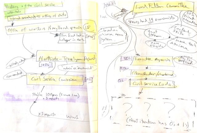
1) Know your history.
Whatever you are making, someone will have done it before, using the tools and thinking of their time.
Start with Wikipedia and work out from there. If the Wikipedia page doesn’t exist, create it. Search for old literature and design assets. Be on the look out for useful quotes and concepts.
 Sketch from the digital by default standard 2012 project
2) Read the legislation.
Read the legislation.
Even if it’s long and boring, read it all. Understand what is law, what are regulations that can be changed, what is just convention.
If you can code, try to write out the core of the legislation in code/pseudo-code to help understand the domain. If you can’t code, find someone who can and ask them to do it and get them to explain what they think.
3) Draw the thing
Aim for something that represents the totality of the service - a mental model for yourself, and something to help you explain it to others.
If you can’t draw, that doesn’t matter, almost no one can. If you are more a ‘words person’ than a ‘picture person’, draw do not write, there is too much ambiguity in words on their own.
Try drawing a mix of screens, process and concept. Avoid clichés like pyramids and concentric circles. While sketching have half-an-eye on what technology, what tools and what skills might be needed to make it.
Keep drawing until you have something that is just-about-convincing and that you are able to re-draw consistently and quickly. Then stop. Do not make it too complete or too polished. Do not reach for Photoshop or Power Point - people will see it as an end product rather than a tool for getting there.
4) Understand the state of technology
Technology can drive product development as much as user need and design. Open Streetmap came into existence 10 years ago in part because of affordable consumer GPS units; bespoke on-demand printing services because of high-quality digital printers. Who knows what Web RTC and other decentralised technologies are about to do to how we use the web?
Spend time understanding the state of technology and design right now. Assume it has changed since you started your last project and that your knowledge is out of date.
Add at least 10 new RSS feeds to your RSS reader (setup an RSS reader if you do not have one). Actively seek out ideas that you can steal to solve the problem at hand. Pay particular attention to changes in browser technology.
5) Seek out metaphors.
The metaphors we have available to us influence the things we make and how we think.
Spend time actively seeking out and thinking of concepts that, in turn, help you think and communicate.
For example - starting a suspension bridge, isostatic rebound, intelligent personal assistants, recommendation engines, z-indexes.
 Post-glacial Rebound
Don’t take them too literally, they are just tools for thinking.
Isostatic rebound, - Image (cc) Mike Beauregard
6) Keep notes, share notes.
Start keeping notes in something simple and sharable like Evernote a Google site or wiki. Put notes and links from legislation and historical reading in there. Start collecting anything even tangentially related to the project. News articles, screen grabs of UI patterns you might steal, technology that might be useful. Photographs of sketches. As more people join the team, share the archive with them.
7) Keep a list of user needs.
Make a list of the top things that users might need from the service based on what you have learnt so far. Ideally do this as a small group (no more than 4 people). Write them on index cards and put them on a wall to see if any obvious groupings emerge.
The aim is not to make a complete validated list, or a process, that will come later. It is to start building a picture and to start understanding what is lacking.
8) Sketch in code.
Build a prototype with as small a number of people as possible in as-small-an-amount of time as possible. 1-3 people in 1-5 days with total freedom. The aim is not to come up with the end product. The aim is to:
- create something manifest to have a conversation around
- to provide initial material for user research that can flush out systemic issues
- show the future
- get people excited
- expose gaps in knowledge
- show how some hard problems might be solved
- show the possibilities of current technology Make it as real as possible - put it online, make it send emails, demonstrate basic validation and use real data.
Make it as broad as possible and resist the temptation to do a thin slice - start with the assumption of a single product or service, and set out to show the edges of it.
Think hard about what you call it and how you describe it - avoid existing terminology or product/service names, people will try and map them onto the existing universe.
9) Get a prototype in front of real users.
Do not focus on testing the details of the interface or design - you won’t have got this right in a few days and your team will have time to iterate on that in the future.
Early in a project, getting a prototype in front of users is primarily a tool to help the team understand the problem space, to spot systemic issues, and to just get to know users of the service better.
10) Throw your prototype away.
Throw the prototype away. It’s a learning exercise, not a product.
- The BBC World Service series Elements uses the elements of the periodic table to look at the world economy. Well worth a listen.
- Ark OS goes into beta
- and owncloud hits version 7. Self hosting is growing up.
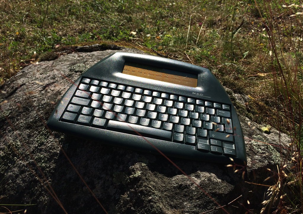 For some reason, I seem to be thinking a lot about input at the moment.
Something specifically that feels lacking - dedicated, internet enabled, writing devices.
A reverse Kindle.
How long before you can buy a Ghost or Wordpress device that is just a keyboard, small display and a big publish button? Will they be open, or a new way people get locked into a platform like Medium?
The image above is of an [AlphaSmart Neo])(https://en.m.wikipedia.org/wiki/Neo_(keyboard)) - a discontinued note taking tool (Image (cc) tdhedengren). Something about that size, with dedicated, tightly bound, software UI would do it. Maybe with some mild built in nagging?
I think I’m going to try and make one.
 Photo of question cards for a digital product
- Who has done this before?
- Who are your users?
- What are their needs?
- What is the right metaphor?
- What tools do you need as a team?
- What does the law say?
- What new technology means you can solve the problem better?
- How will you test the concept quickly?
- Can you draw it?