Service marginalia
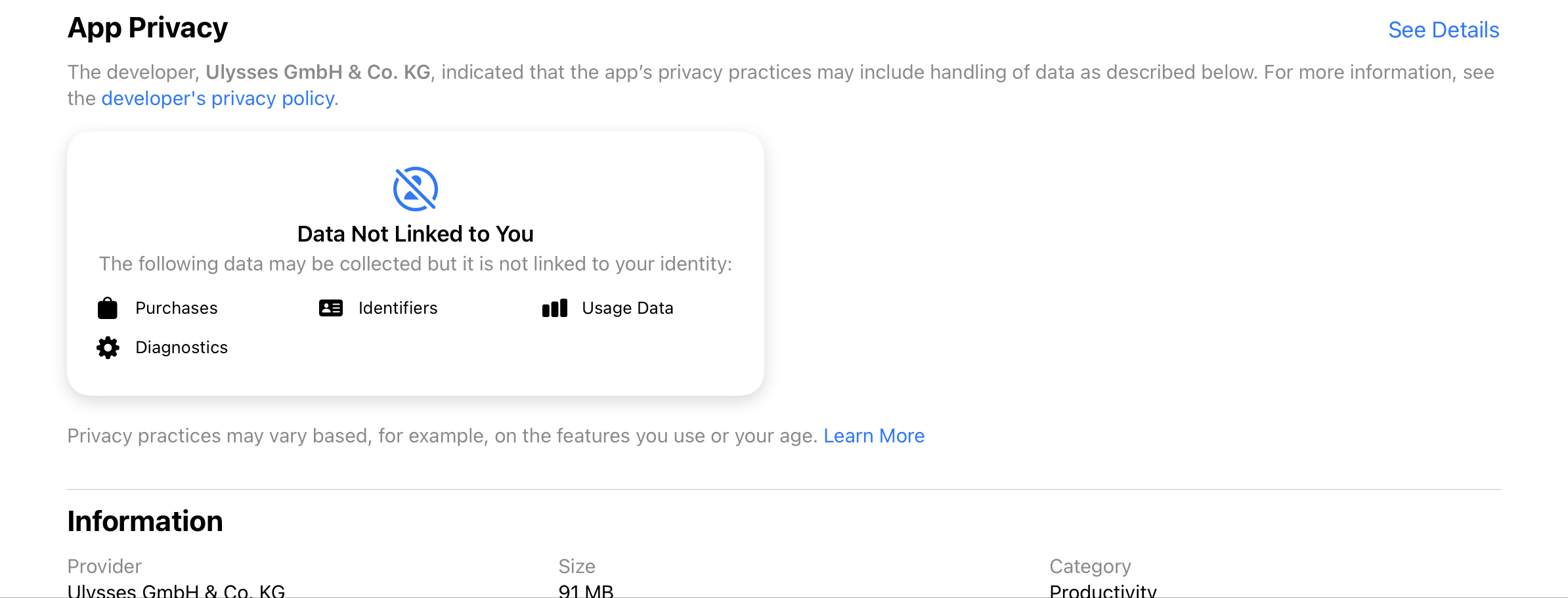
It strikes me that Apple’s privacy labels ….

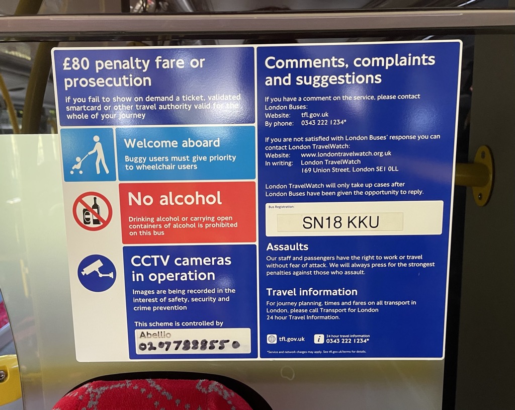
… are the same class of thing as …

… scribblings in the margins of a service that give context, help build a bigger picture about the ecosystem the service operates in, provide escape routes when things go wrong, or surface the rules that govern its use.
Digital design in the public sector doesn’t really make space for things like these. That’s hard to do if the design ethos is minimalist or reductive (which are generally good approaches if you are designing for task completion, maybe less so for signposting recourse or explaining who operates a service and how they do it).