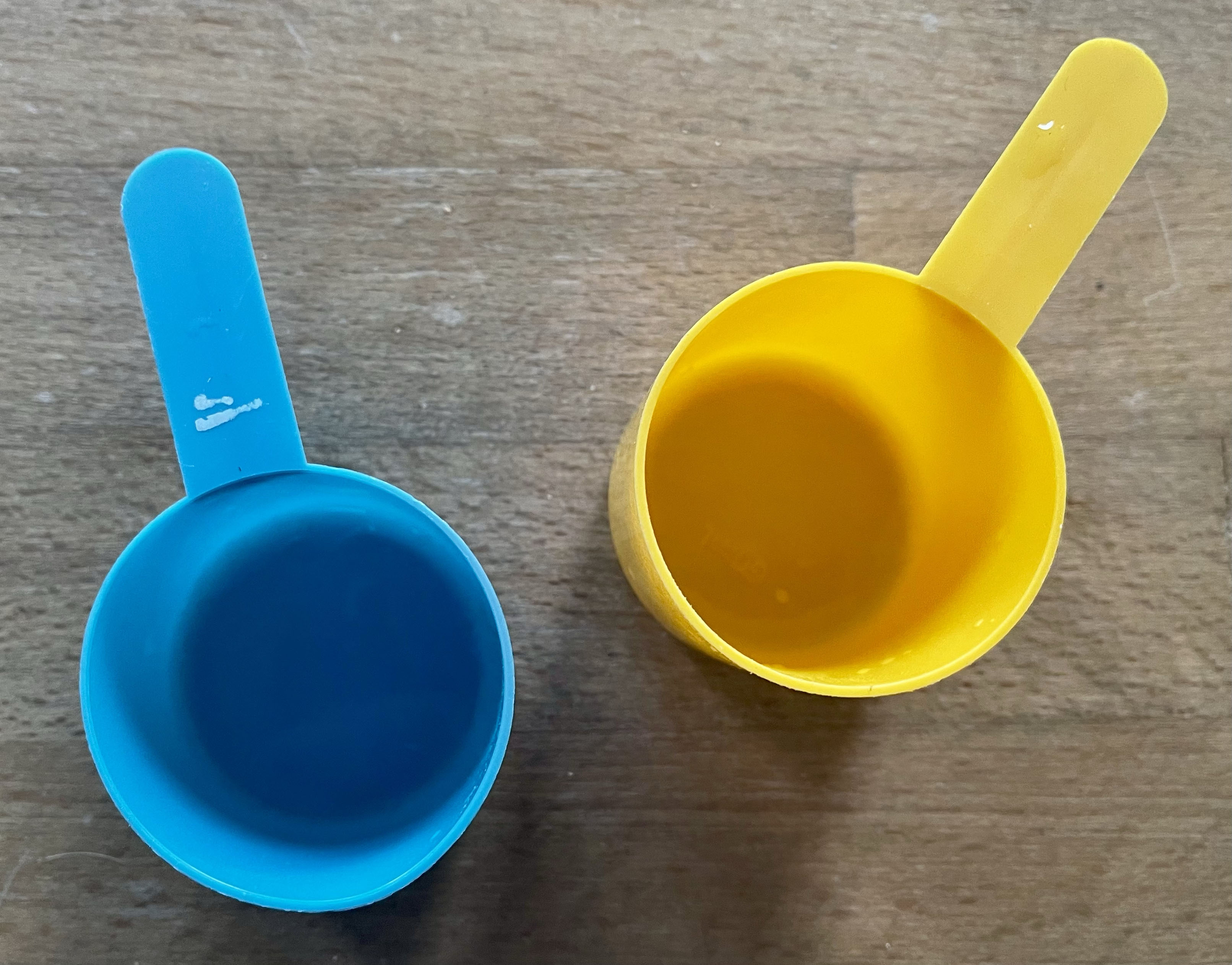
How this thing works

These two plastic scoops came packaged with our dog’s food. It’s one of those monthly subscription services and the scoops came in the welcome pack. The food is dehydrated, you mix it one-to-one with water before serving it. One scoop is blue (for water), and one is yellow (for the dried food). But the scoops are the same size and have a volume of 4 tablespoons (save a millimetre or two). It doesn’t actually matter which one you use, or if you use one or both of them. The purpose of the two different scoops is not functional, it’s to communicate how the concept works straight out of the box. It says ‘here’s how these parts fit together’. It’s an example of self-explanatory design, of legible design.
I realise it’s a bit of a jump from dog food to complex public services, but those scoops are currently a daily reminder to me that one of the things I value about the design is its ability to explain and contextualise. This, I think, is at the root of my frustrations with the approach to design in the UK public sector. The ability for design to explain where something fits within in a larger system, not just design to achieve immediate outcomes, is under used.